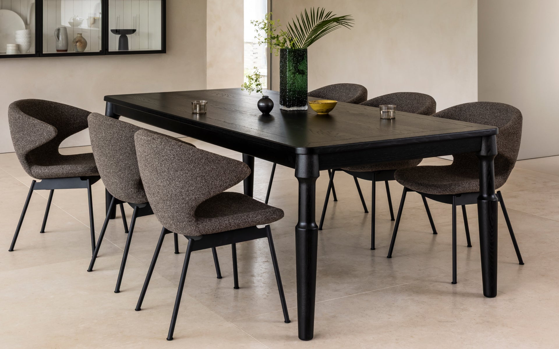
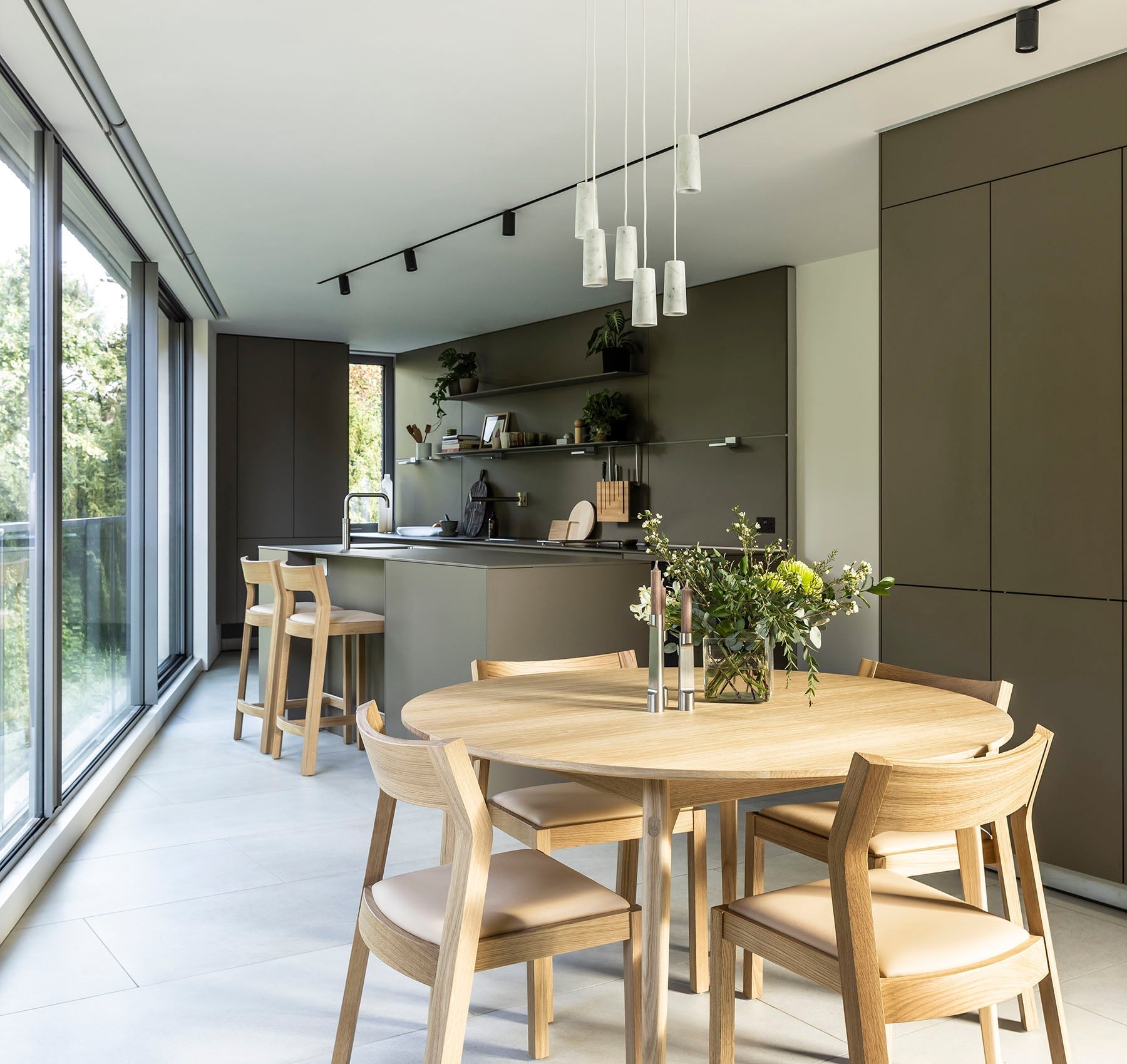
Case launched the now iconic Cross Extending Table at Salone del Mobile 2006.
Almost 2 decades later, the Cross Table still remains one of the most recognisable Case products, and it has since expanded to a successful wider range which includes coffee tables, side tables and more.
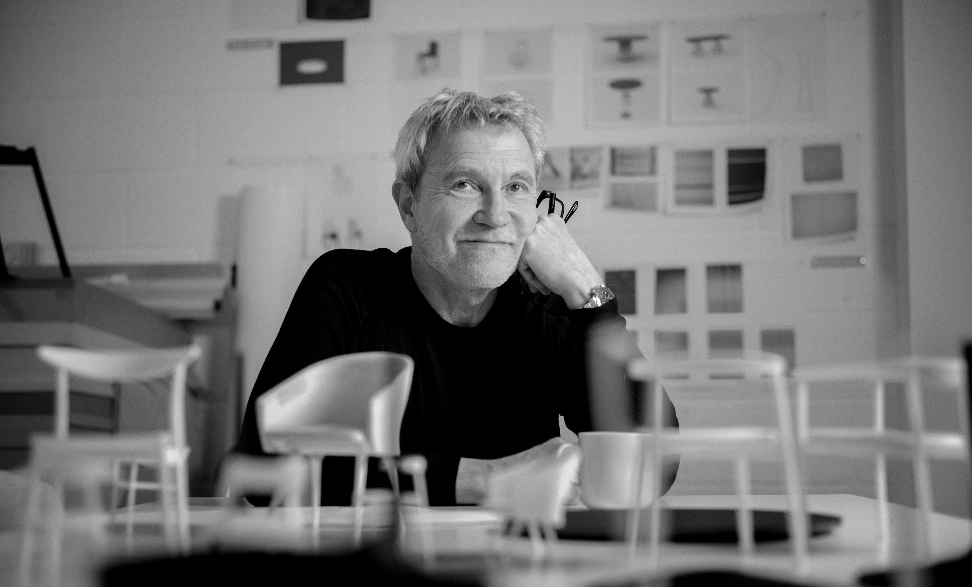
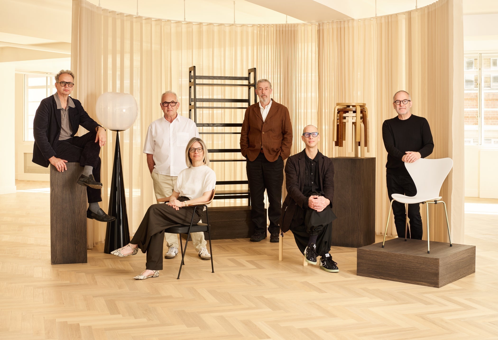
We sat down with designer Matthew Hilton to hear about his design inspiration for the Cross Table, the challenges of constructing an extending table and how compromise can be a good thing.
 Photo © Ruth Ward
How did the Cross Extending Table come about, did you have a particular inspiration?
The Cross Extending Table was the first piece I designed for Case back in 2005. There were a number of briefs offered to us designers and I chose the extending table. I had previously worked on some when I was head of the furniture design team at Habitat, so I had some experience of the challenges we were facing. I enjoy difficult briefs, and I particularly like to improve and develop extending tables. Case is focused on good quality, good-looking and highly functional pieces. Paul Newman (Director at Case Furniture) and the team are persistently and enthusiastically searching for new manufacturers who can give us better, more innovative products of higher quality at a price which sits in the higher level of mid-market. This is an interesting place to be designing.
The design of the table evolved in its development. The first models had legs which crossed over under the table across it’s width but we wanted to avoid people hitting the table legs. The obvious solution is to put a leg on each corner but I wanted to find a way to make this piece stand out on the market. The most practical solutions are sometimes unfortunately the least interesting. Visually I wanted it to have presence - I wanted people to see it and either love it or hate it. I wanted it to be a strong thing, so that people would have proper feelings about it. When you try to appeal to a lot of people, that often fails - I think you have to make a stand and just appeal to the people you appeal to. I want to make intriguing pieces, noticeable but not screaming for attention. A combination of all the factors in the brief become the inspiration.
Design is not just about how something looks, we also deal with the manufacture, quality, packaging, shipping, and home assembly. Cross is now a really well-developed design, it has continued to slowly evolve.
How can manufacturing influence the way things look?
It’s probably not visible to other people, but being obsessed with efficiency is an approach that helps us make decisions on which way to go. You’ve got to make decisions and becoming obsessed with something is quite good for that. Sometimes you can’t do exactly what you want to do, and you've got to find the best answer you can in that situation. You start off with inspiration and an aesthetic thing, but you have to compromise. Design isn't just inspiration and creativity - it is compromise, but compromise that is within a framework and structure. It’s not a negative part of the process.
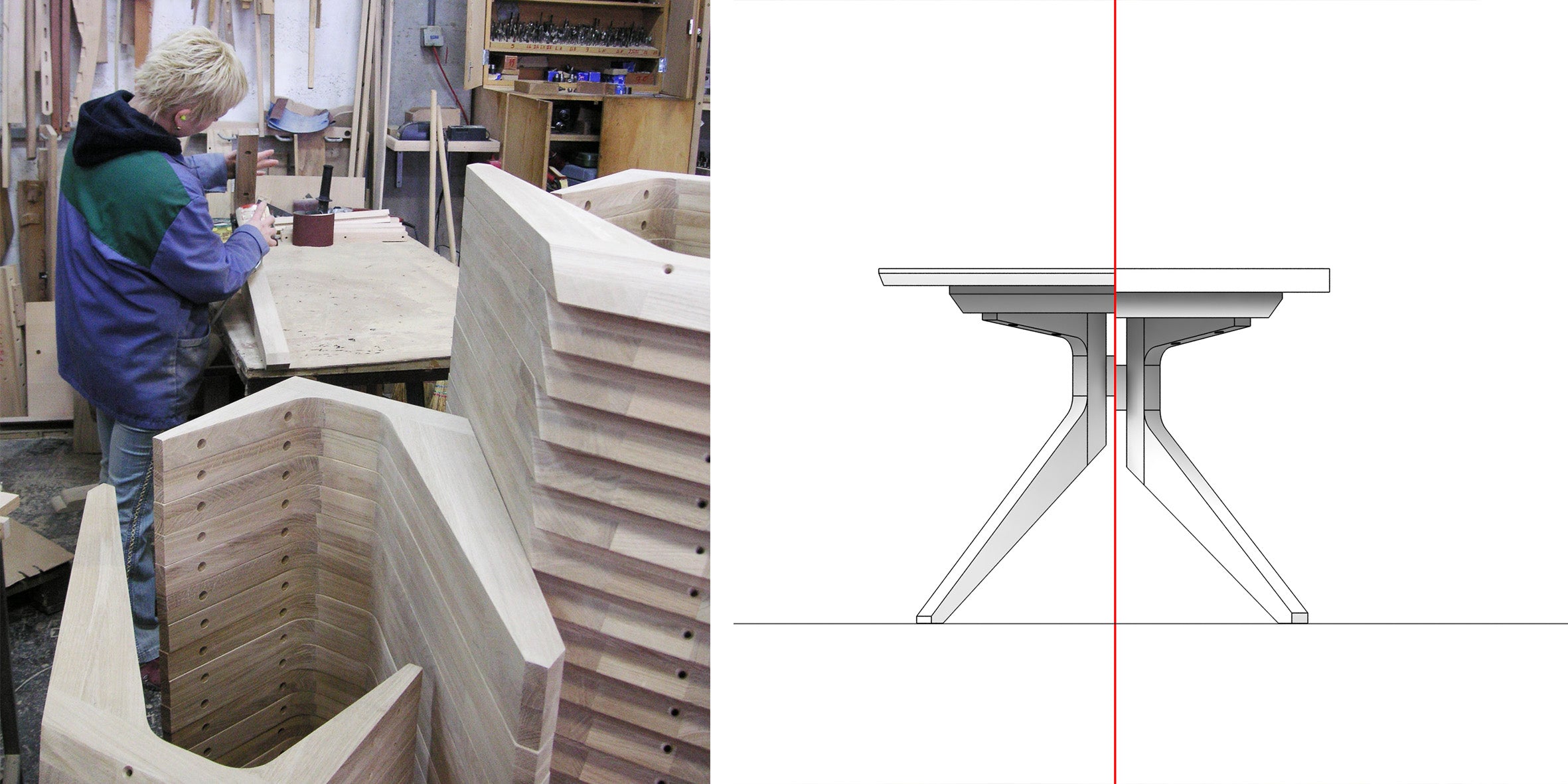
Over the years, Cross has evolved in response to feedback from our customers. From increasing the width of the tabletop, allowing a more generous serving space to introducing a slim solid-wood chamfered edge to provide better durability and visual lightness, and refining the assembly process to make it even more user-friendly. All while retaining the signature features and details of this iconic design.

